
gwooden_코린이
HTML + CSS 가상클래스 ::before와 after 본문
728x90
- ::before
- ::after
- 태그::before
- 해당 태그 부모
- before, after -> 자식 (인라인)
<!DOCTYPE html>
<html lang="en">
<head>
<meta charset="UTF-8">
<meta http-equiv="X-UA-Compatible" content="IE=edge">
<meta name="viewport" content="width=device-width, initial-scale=1.0">
<title>Document</title>
<link rel="stylesheet" href="css/style.css">
</head>
<body>
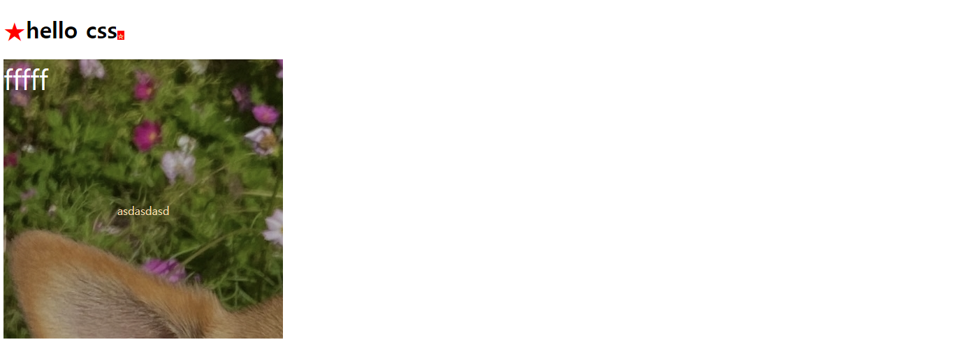
<h1>hello css</h1>
<div class="con">
<p>asdasdasd</p>
</div>
</body>
</html>h1::before {
content: "★"; /* 콘텐트 필수 속성 */
color: red;
}
h1::after {
content: "☆";
background-color: red;
color: wheat;
font-size: 10px;
}
.con {
width: 400px;
height: 400px;
background: url('../image/bambi.jpg');
position: relative;
}
.con p {
position: absolute;
left: 50%;
top: 50%;
transform: translate(-50%, -50%);
color: wheat;
}
.con::before {
content: "fffff";
color: white;
font-size: 40px;
background: rgba(0, 0, 0, 0.3);
position: absolute;
width: 100%;
height: 100%;
top: 0;
left: 0;
}
<!DOCTYPE html>
<html lang="en">
<head>
  <meta charset="UTF-8">
  <meta http-equiv="X-UA-Compatible" content="IE=edge">
  <meta name="viewport" content="width=device-width, initial-scale=1.0">
  <title>Document</title>
  <link rel="stylesheet" href="css/style.css">
</head>
<body>
  <!-- <h1>hello css</h1>
  <div class="con">
    <p>asdasdasd</p>
  </div> -->

  <a href="http://naver.com">네이버</a>
  <a href="http://daum.net">다음</a>
</body>
</html>
a::after {
content: '('attr(href)')'
}
<!DOCTYPE html>
<html lang="en">
<head>
<meta charset="UTF-8">
<meta http-equiv="X-UA-Compatible" content="IE=edge">
<meta name="viewport" content="width=device-width, initial-scale=1.0">
<title>Document</title>
<link rel="stylesheet" href="css/style copy.css">
</head>
<body>
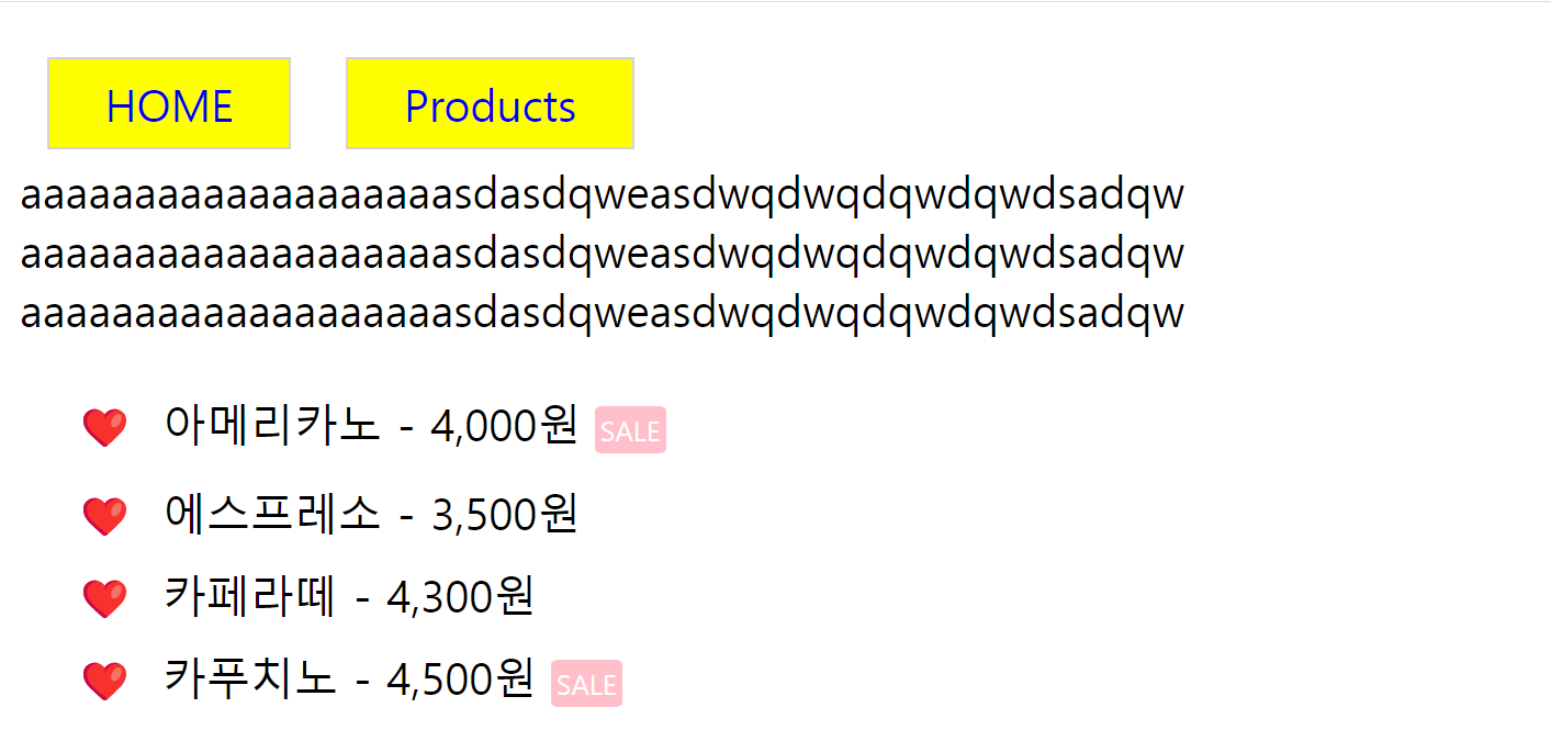
<div class="h">
<a href="#">HOME</a>
</div>
<div class="h">
<a href="#">Products</a>
</div>
<div>
<p>aaaaaaaaaaaaaaaaaaasdasdqweasdwqdwqdqwdqwdsadqw
aaaaaaaaaaaaaaaaaaasdasdqweasdwqdwqdqwdqwdsadqw
aaaaaaaaaaaaaaaaaaasdasdqweasdwqdwqdqwdqwdsadqw
</p>
</div>
<div class="list">
<ul>
<li class="sale">아메리카노 - 4,000원</li>
<li>에스프레소 - 3,500원</li>
<li>카페라떼 - 4,300원</li>
<li class="sale">카푸치노 - 4,500원</li>
</ul>
</div>
</body>
</html>.h {
float: left;
padding: 10px;
}
p::before {
content: "";
display: block;
clear: both;
}
a {
text-decoration: none;
border: 1px solid lightgray;
background-color: yellow;
padding: 5px 20px;
}
a:hover {
opacity: 0.5;
}
ul {
list-style: none;
}
ul li {
line-height: 30px;
margin-left: -20px;
}
ul li::before {
content: "❤️";
padding-right: 10px;
}
.sale::after {
content: "SALE";
font-size: 10px;
background-color: pink;
color: white;
padding: 2px;
margin-left: 5px;
border-radius: 10%;
}
728x90
'프론트엔드 > html' 카테고리의 다른 글
| HTML + CSS 시맨틱 태그(semantic) (0) | 2022.12.20 |
|---|---|
| HTML + CSS display:flex (0) | 2022.12.20 |
| html + CSS 가상 클래스 (0) | 2022.12.19 |
| html + CSS 애니메이션 (0) | 2022.12.19 |
| html + CSS transform 기능 살펴보기 (0) | 2022.12.19 |
'프론트엔드/html' Related Articles
more


Comments